Basic Mapping in R
R
Oceanography
Data Visualization
1. Plotting Coastlines and Simple Maps with oce
The oce package includes a built-in coastlineWorld dataset, which we can use to create a basic global map.
Load data
Adding Bathymetry (Optional)
If you have bathymetry data (e.g., from ETOPO1), you can overlay it:
Code
# Example: Simulated depth data (in practice, load real bathymetry)
lon <- seq(-180, 180, by = 5)
lat <- seq(-90, 90, by = 5)
depth <- outer(lon, lat, function(x, y) -5000 * cos(x/50) * sin(y/50)) # Mock data

# Plot
imagep(lon, lat, depth, col = oceColorsTurbo,
       xlab = "Longitude", ylab = "Latitude",
       main = "Simulated Ocean Depth (m)")
plot(coastlineWorld, add = TRUE, col = "black") 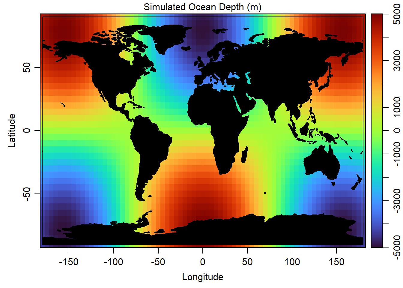
2. Advanced Ocean Maps with ggplot2
For more customization, we can use ggplot2 with oce data.
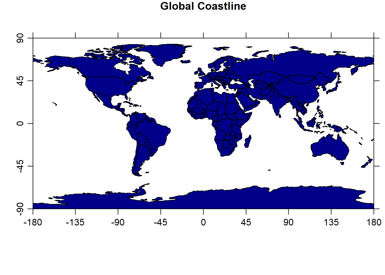
A. Plotting Coastlines with ggplot2
Code
library(ggplot2)

# Convert oce coastline to a data frame
coast_df <- data.frame(
  lon = coastlineWorld[["longitude"]],
  lat = coastlineWorld[["latitude"]]
)

# ignore the warning message

ggplot(coast_df, aes(x = lon, y = lat)) +
  geom_path(color = "navy", linewidth = 0.3) +
  labs(title = "Global Coastline", x = "Longitude", y = "Latitude") +
theme_minimal() 
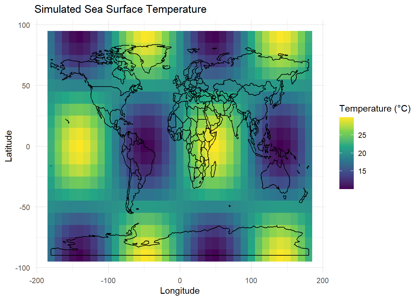
B. Adding Oceanographic Data (Example: Temperature Gradient)
If you have a temperature dataset (e.g., from a CSV or NetCDF file), you can visualize it like this:
Code
# Create simulated temperature data
set.seed(123)
temp_data <- expand.grid(
  lon = seq(-180, 180, by = 10),
  lat = seq(-90, 90, by = 10)
)
temp_data$temp <- with(temp_data, 20 + 10 * cos(lat/30) * sin(lon/30))

# Plot with proper layer separation
ggplot() +
  geom_tile(data = temp_data, aes(x = lon, y = lat, fill = temp)) +
  geom_path(data = coast_df, aes(x = lon, y = lat), color = "black") +
  scale_fill_viridis_c(name = "Temperature (°C)") +
  labs(title = "Simulated Sea Surface Temperature",
       x = "Longitude", y = "Latitude") +
  theme_minimal()